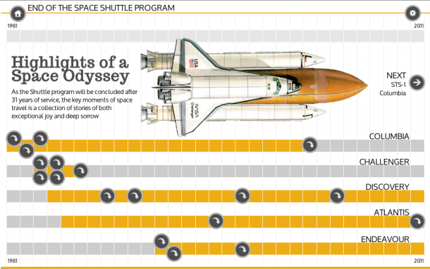
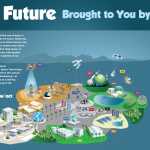
 We’re fans of data visualizations and infographics at Tumult, so we’re naturally thrilled when we see Tumult Hype being used by news organizations like Reuters and the LA Times. We last explored infographics here with Bart De Neve’s infographics for De Standaard.
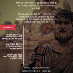
To continue the conversation, I (virtually) sat down with one of our favorite Tumult Hype creators to dig into his process. Konstantinos Antonopoulos, the handsome man pictured on the right, creates infographics for in.gr, a popular news website in Greece. More than just visualized data, his documents lead users down a storytelling path, with more narrative than simply data. He was kind enough to offer his thoughts on
- Iconography for user interaction
- His testing process, and perhaps most importantly
- Starting with pen and paper.
I hope this conversation is helpful for others working with visual data. If you would like to explore his Tumult Hype documents, read on.
Daniel: Infographics can be so open ended, so I’m wondering how you approach the creation of clickable and tappable elements in Hype. I notice you use a lot of plus (+) and arrow iconography to encourage interactivity.
Konstantinos: The infographics I create for in.gr are usually structured in order to tell a story. They are not executed as data visualization, but as multimedia storytelling, where the data, the pictures, the text and the multimedia are there to support the story – but the narrative is in the spotlight.
And this narrative is, really, a bunch of decisions I have to take before I even fire up Hype: what do I want to say? How do I construct my story? How can I support my storytelling? How can I enrich it? How can I break it down, scene by scene, for the user to understand and better interact with it? How can I make sure that it tells the story AND it is clear and uncluttered, concise and to the point?
Iconography helps with that a lot: it is a guide for the users to take them down the storytelling path. The icons usually trigger timelines inside every scene, where each timeline has an extra element to the story: it may be more text, another picture, data or multimedia. This method helps me keep each scene clear on first visit (a title, a descriptive text and a picture) and have a lot of additional content available on a tap or click.
I try to use as little animation as possible, since I do not want it to be distracting from the focus of the story. These are news items and the story always needs to take the front seat. Hype is a fantastic story-telling tool that gives me much freedom to control the flow of information to the user.
What technical steps (if any) do you take to prepare your Hype document for display on the web?
Most of the technical work is a repeated process: the javascript to connect the scenes together (I am using different .hype files for each scene) and the editing of the .html files to include some specific code for the SEO and the Nielsen ratings are a daily routine.
Some of the elements are prepared in Illustrator (yeah, old habits die last…) and are exported as .png images, so that requires some attention.
Working with fonts is a routine that I am paying extra attention. While I have not finalized the infographics specs, I am using Open Sans in these latest graphics and I am paying extra attention to getting the typography right.
For a visual journalist who does not know html, css or javascript, I’d say that Hype itself, as well as its support, have simplified lots of technical processes and have taken the load off me many times.
But, overall, the thing that matters the most is testing the infographics out in all the browsers and all the formats. The text rendering in Firefox, for example, has produced some mistakes for me in the past and, from that moment on, I usually take all the time needed for previewing.
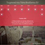
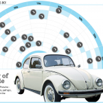
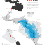
Konstantinos’ recent work.
And finally, do you have any tricks to share with other creators?
It is not a secret in the community that every infographic begins with pen and paper. The thoughts are becoming scenes and timelines and the narrative is built. Using a sketchpad or a visual layout tool before firing up Hype makes the job so much easier.
Mastering the timelines is essential in controlling the information. Timelines in Hype are a fantastic concept, are very easy to learn and a very powerful companion to the scenes.
For the moment, I am playing it safe and not using any of the Hype features that are supported only by modern browsers – but I will definitely try to incorporate some filter effects (blurs, especially) in the future graphics.
I am also looking for inspiration among the community and I’m trying to keep up with their creations – and, especially, the infographics artists among them: Les Hewitt, Cath Levett, Bart De Neve and the rest of the news artists and visual journalists are producing amazing stuff and I am very inspired by their work and thankful for them sharing it.
We hope you enjoyed this brief discussion. Konstantinos has made a few of his Tumult Hype documents available for download. If you have any questions for Konstantinos, you can find him at @konstantinosant.

