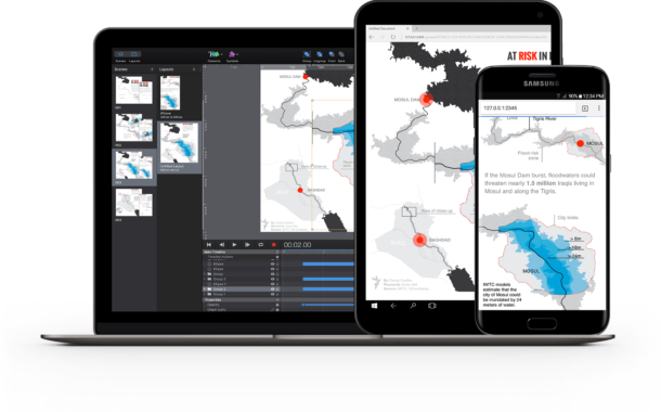
In this post, I’m going to share some tips on creating infographics & data visualizations in Tumult Hype and show off a few amazing examples.
Who am I? I’m Tumult’s support director, and it’s my mission to help journalists, design agencies, digital book designers, and museums make the most of what Hype can do. So what is Hype? Hype is a tool for producing animations, interactive experiences, and timeline-based visual work geared for the web. Learn more here.
The tips I’m putting forward here (and in subsequent posts on this topic) are geared towards people using Hype for infographics and data visualization who have a general understanding of what Hype can do and want to fit the tool into their work. Start with the tutorials or documentation if you are just getting going with Hype. You can download a 14 day trial for MacOS here. If you’re looking for recent infographics produced with Hype, check the infographics section of our gallery, our infographics page, and don’t miss the examples below:
- Quality work on geopolitical issues centered in conflict zones by Carlos Coehlo for Radio Free Europe
- A range of work and an interview with Konstantinos Antonopoulos
- Bart de Neve for de Standaard in Belgium & Modesto Juan Carrasco’s work for El Mundo in Spain
Telling your Story
I had a chance to speak with Scott Berinato, who writes extensively on data visualization for Harvard Business review. Mr Berinato wrote the book on persuasive data visualizations and I want to share a couple points from our conversation that directly relate to animation & data visualization:
- Animation should not be decorative. Use it sparingly to serve a purpose such as to reveal key insights or show change over time.
- Density is an attention killer. Selectively reveal data by doling it out in small pieces to make a point. The ‘selective reveal’ as Scott calls it may also take the form of providing your audience an example on exactly how to navigate a large array of data.
For more on this topic, read ‘Visualizations that really work.’
In this first post, I wanted to show two technical approaches to displaying data: One using pure Hype elements & the Hype API, and one using a JavaScript-based charting library.
Recreating Charts with Regular ol’ rectangles (and optional JavaScript)
For this exmaple, we’re using some extremely contemporary data: The excellent summary of research on public comments regarding Net Neutrality by Jeff Fossett. This chart shows the overwhelming support for Net Neutrality in a bar chart style:
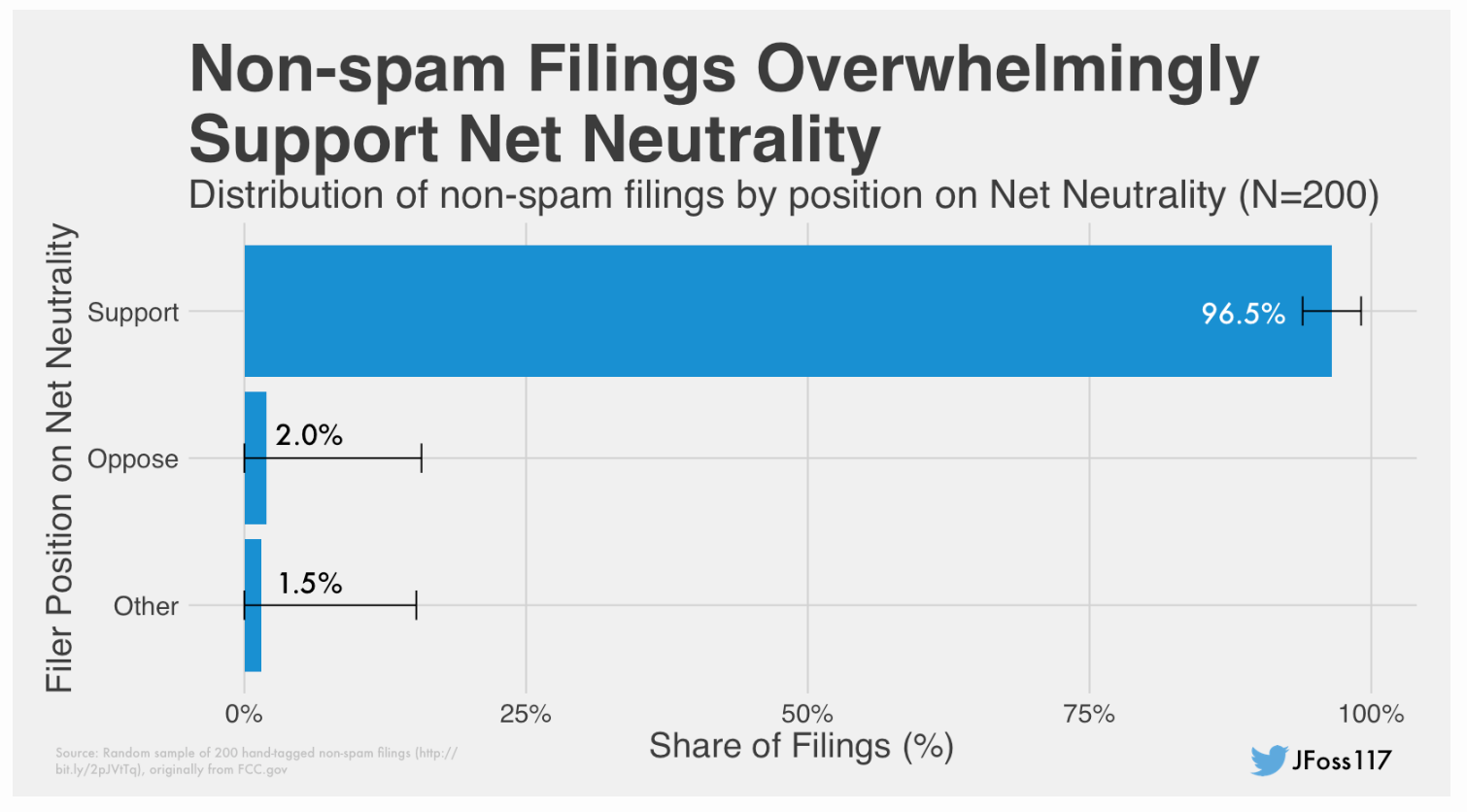
In our Hype-ified version, we want to animate the blue bar chart to animate the three ‘Filer Position’ data points in succession. To start, I’ll make a version without the bars, and then create rectangles of the same height & color Jeff used. Using the Record button, I can animate the expansion of the bars to match up to their length in the static version. For a bonus, I let the user guess what the percentage of commenters supported Net Neutrality:
Taking a graph from static to interactive lets you play a bit more with the data, make it more engaging, and gives you the opportunity to challenge assumptions. Within this chart, JFoss117 in the lower right corner links to Jeff’s recent tweets & graphs on #NetNeutrality, and the animation can be replayed by clicking the refresh icon in the upper right.
The key JavaScript for the submission button and chart animation uses vanilla JavaScript and the Hype API to animate our ‘guess’ onto the chart:
    // What did the user input? (Examples would be 1-100).
    // parseInt Converts the input to a usable number (without %)
    var submissionvalue = parseInt(document.getElementById('current').value );

    // Convert the submission number to a width
    // If the user were to guess 100, then the height should be 316 pixels wide.

    var ElementWidth =  (316 * (submissionvalue * .01));

    // Set the Bar to be a width based on the above percentage
    hypeDocument.setElementProperty(BarGuessOverlay, 'width', ElementWidth, 1.0, 'easein');

    // Insert guess value in box:
    document.getElementById('BarGuessOverlay').innerHTML = 'Your guess: ' +  submissionvalue + '%';
Use virtually any HTML/CSS/JS or JavaScript-based Library
The number of tools available for the infographic producer is staggering. In your work you may have finalized code for charts, video players, or maps. You may even need to link up your animations to your publication’s analytics system to measure engagement. Because Hype is based on standard DOM web technologies, you are very flexible the web technologies you can integrate, from the D3 charting library to Google Analytics. Here’s a few tips:
Regular HTML can be easily inserted within the ‘Inner HTML’ of a rectangle. If you have web fonts or specific text styles you wish to use, you can easily use them in your project. Read our typography documentation on how to use Google Fonts, Monotype or Typekit Fonts, or icon-based fonts.
Content like maps, external video players, or pre-made charts hosted elsewhere can easily be inserted as an iframe. Select Insert > HTML Widget to create an iframe.
For something a bit more advanced like a dynamic charting or visualization library, you typically have three pieces that fit into different parts of Hype: 1) An external library that loads the JS code required for your chart, 2) A <div> that contains your rendered chart, and 3) an initialization script that defines the data & functionality of your chart.
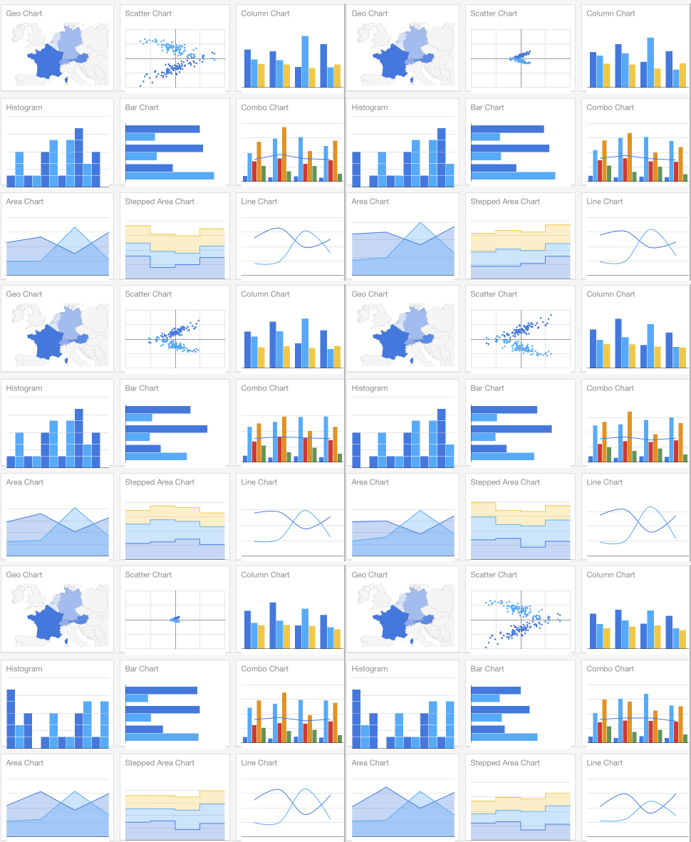
In the example below I’ll walk through how to use the Google Charts library. You can easily load JSON data into Google Charts to create a number of graph types:
To work with this library in Hype:
1) Load the Library in the ‘head’

Place any external libraries required in the Head of the Hype document. You can edit the contents of the of your exported .html file by clicking on ‘Edit HTML Head’ in the Document Inspector. This gives you access to the functions and functionality anywhere within your Hype document (though it does not extend to within HTML widgets).
Using the Google Charts Quickstart guide as a jumping off point, I’ll use data on the recent Net Neutrality comments and adapt it into a donut chart. Mmm donuts. Mmm Neutrality.
First, I’ll create an ‘On Scene Load’ function to load our chart data:
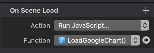
I can paste in this code to run the Chart JavaScript (note that I don’t need any ‘script’ tags):
  // Load the Visualization API and the corechart package.
  google.charts.load('current', {'packages':['corechart']});

  // Set a callback to run when the Google Visualization API is loaded.
  google.charts.setOnLoadCallback(drawChart);

  // Callback that creates and populates a data table,
  // instantiates the pie chart, passes in the data and
  // draws it.
  function drawChart() {

    // Create the data table.
    var data = new google.visualization.DataTable();
    data.addColumn('string', 'Topping');
    data.addColumn('number', 'Slices');
    data.addRows([
      ['Support', 96.5],
      ['Oppose', 2],
      ['Other', 1.5]
    ]);

    // Set chart options
    var options = {'title':'Distribution of non-spam filings by position on Net Neutrality',
                   'width':400,
                   'height':400};

    // Instantiate and draw our chart, passing in some options.
    var chart = new google.visualization.PieChart(document.getElementById('chart_div'));
    chart.draw(data, options);
  }
Next, we need to add a rectangle (Insert > Rectangle) which will contain our chart. I’ll assign an id of chart_div (referenced in the last line above) so the above JavaScript has an element in which to render its chart:
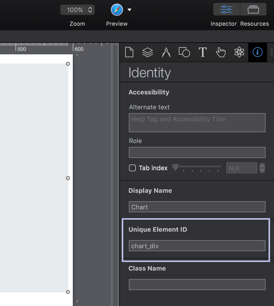
That’s it! Now when we preview, the JavaScript will render in the rectangle and we have a chart, which shows a more donut-like view of Jeff’s research.
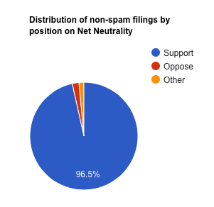
Since the JavaScript function can be triggered at anytime, and our rectangle is a regular animateable Hype element, we have enormous flexibility over how and when this chart is rendered.
Note: You can load your charting library directly from your Hype document’s resource library if you’d prefer not to rely on a CDN.
If you’re working on infographics and you’d like to share examples, tips, or have questions, please get in touch on the forums or @hypeapp.
Coming next: Charting live-updating data loaded in a Hype document.

