 If you’re working on a Tumult Hype document for mobile devices, you may be interested in our new knowledge base article: “Tips for making your Tumult Hype production Mobile Friendly.” Of course, every Tumult Hype site is already compatible on Android 2.3+ and iOS, but there are a number of enhancements you can make. The article includes example files and covers the following topics:
- Fitting your document to the width of devices
- Removing the Mobile Safari user interface (URL & navigation bar)
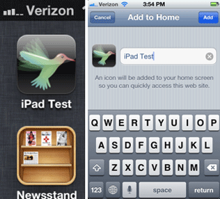
- Adding home screen icons and a loading screen, also known as a ‘Startup Image’ (iOS only)
- Detecting swipes
- Showing a different site based on the orientation of the device (Landscape & Portrait). Also: keeping the current scene in sync between those two orientations using the Tumult Hype javascript API.
- Mobile Safari-specific CSS
For a live example of a Tumult Hype site that feels like a native app, please visit the Diesel Punk Movie player on your iOS device (it’s optimized for iPad):

If you have any additional tips for handhelds, we’d love to hear them. Drop us a line.